FeatureBase is the first OLAP database built entirely on bitmaps, which means there is not an abundance of real-world information floating about in the cosmos yet about how to use FeatureBase as you would find for a derivative database. The following writeup is intended to provide easy code examples on a real use case, with an added splash of my own learning journey (mostly for your entertainment).
My name is Garrett and as the Lead Solutions Architect here at FeatureBase I help our community learn about our technology, and develop ways to move old and new workloads to our products. In practice users typically have existing systems up and running and FeatureBase takes over the heavy lifting on the backend. This translates to spending most of my time on data engineering exercises; data modeling, data ingestion characteristics and transformations, performance tuning, and a host of other backend related tasks. Because of this I have not had much exposure to building frontend applications – specifically user interfaces (UIs). I thought it would be interesting to plug FeatureBase Cloud into a publicly available frontend tool and force myself to build a rudimentary UI to query data. Follow along as I work from the ground up, starting with data generation, data ingestion, building queries, and finally serving through an HTTP API to hosted UI. The best part is all of this is completely free for a developer to follow along AND I’ll be using a powerful real-world use case as the basis for this journey..
Without further ado, let’s dive into the project and you can enjoy my suffering as I gain an incredible respect for UI designers and Front-End developers! (And of course, you’ll learn how to use FeatureBase for real-time dynamic customer segmentation).
CLICK HERE to be directed to our GitHub with all relevant code and examples.
If you choose to follow along without visiting GitHub you will need the following:
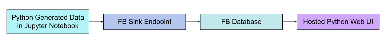
I decided to start by generating data in python, as it makes it easy to test streaming into FeatureBase Cloud. We will create a Database structure within FeatureBase, create our tables, and set up our endpoints to accept the generated data. Then we will build a rudimentary web app (emphasis on rudimentary) within Anvil’s environment and experiment building and issuing queries using http requests through the FeatureBase API. The data and queries are representative of a real use-case handling customer loyalty data with a focus on dynamic segmentation.
TLDR: Generate Data, pump it into FeatureBase, build UI to query data and display stuff to users.
The data and query patterns we use are all derived from a very valuable use case deployed using FeatureBase. A global advertising technology company provides a service that allows their customers to uncover deep consumer insights and activate that data to reach growth audiences with content aligned to their interests. This requires extremely rapid segmentation of hundreds of millions of records..
The challenge of this use case is collecting very sparse relationships about consumers, and updating them across a huge amount of records, all the while providing low-latency queries needed to slice and dice the data…(without racking up a huge AWS bill!).
In this exercise, I will be using data about Customers. I have a unique identifier for each customer, similar to a UUID (universally unique identifier, just not 128-bits) . To keep things simple, I’ll focus on aggregate analysis so that we may better serve our loyal members with more accurate announcements that go region wide.
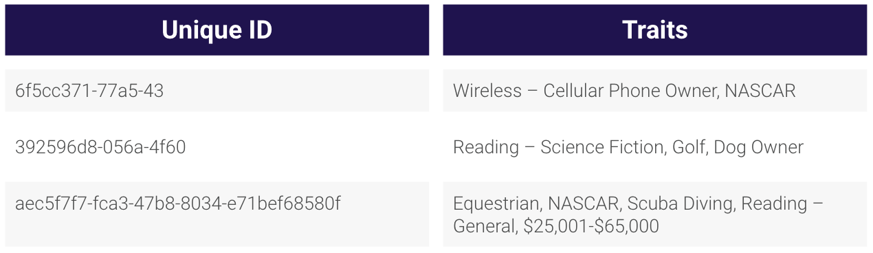
You’ll notice this table isn’t laid out in a columnar or relational traditional model, in fact it buckets all the data into groups under one field. Essentially, all the various information is placed into a boolean-like membership representation and takes advantage of unique FeatureBase power known as the SET field, more on that here.
While FeatureBase Cloud has a nice UI, this exercise walks you through setting up FeatureBase using the APIs. The Jupyter notebook available in GitHub walks you through the following:
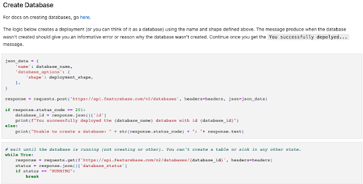
Once the steps above have been completed, it’s time to generate data and write it to the sink (i.e. the table)!
The next step is to generate data and send it to the sink. The last cell in the attached Jupyter Notebook contains this logic. As described above, each record contains a unique ID and the traits or segments associated with that ID. You’ll see that a random value is chosen from the following lists of traits:
Next you’ll see that some number of random interests are selected. This collection of traits makes up the list of traits or segments associated with the current record.
Once one thousand records have been generated, the batch is sent to the sink endpoint. In turn, the sink endpoint accepts, parses, and writes those messages to the FeatureBase table. Records will be generated and posted indefinitely (i.e. until you stop the cell). At this point, you’re ready to consume data from the FeatureBase table!
Setting up a cloud account was easy and Anvil had tons of available guides and tutorials to get started. I chose a blank app and decided to tackle a simple plotting interface for version 1. Now, I had much more grandiose plans to build a full segmentation interface (and still might in the future) that would allow a user to pick and choose from various segments on the fly. But as I discovered, even with a leg up, designing and handling all the http request behavior is quite a challenge. Not to mention pining over the aesthetics when a plot object doesn’t center the way I want. I ended up spending most of my time on the performance element of how to build out the correct HTTP Requests when the user takes certain actions.
I chose to build the UI on Anvil for three reasons:
It’s great to get started with this dashboard page to get an understanding of how to represent data and start working with the various pre-configured components. Following the guide I built a simple interface with a few plots (leaving room at the bottom for some newer components we’re going to build in just a moment).
If you already have your FeatureBase Cloud, Jupyter Notebook, and Anvil Cloud accounts setup then you can jump here, to start building your own interface on Anvil.
In this example we build a button that the user can press to run specific queries and create a visual plot. Not the most dynamic build just yet, but we want to start small to get a feel for building HTTP Requests and retrieving data from FeatureBase. The intention is to not store or cache results, leaving everything in the UI (including queries) to execute at runtime. Besides skipping the management of intermediary results, this provides users incredible flexibility when exploring data. Effectively, any query can be built and executed which keeps all the dimensions of the data at the user's fingertips, without requiring cache for even the largest SUM(), Count(), or complex multidimensional calls.
For example, the below code snippet uses Anvil’s request module (similar to Requests package in python) to send a SQL query to FeatureBase Cloud and quickly parse the result. Normally sites can run a whole bunch of roll-ups and aggregation queries as soon as a user hits the site, or even before to pre-populate a cache with precomputed values. The benefit is the appearance of snappy performance when those calls are executed, the downside is what happens if the data is updating at high frequency or the user needs to select dimensions not present in the roll-up? In essence, the sacrifice is data freshness and flexibility for speed.
Now that we have the request built we can start attaching it to various user prompts, such as the button. In Anvil, we dragged and dropped the button onto the card component and we simply need to append the following code:
Now when a user lands on the page, a button will appear and upon click will execute our query call (hard coded) and invoke Plotly to create a plot!
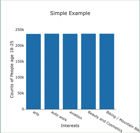
I chose to run a wide query that counted 5 specific interests across the age range 18-25 and plot the counts. The results can be seen in Figure 3.
To wrap up, we’ve set up a FeatureBase Cloud account, generated user data, built HTTP queries, and created a button to execute a specific query and plot the results! In Part 2, we will expand on these concepts to build radial dials that allow us to select various segments (as opposed to hard coded queries) and see outputs based on dynamic queries. Additionally, I will learn more about HTTP request behavior and work on making them as performant as possible with better packaging.


